Assignment: Lesson 2 – Infographic
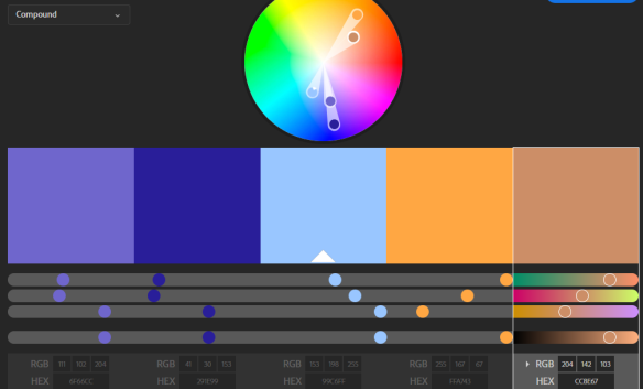
Adobe Color Wheel (link below)
Create an Infographic (10 points)
There are a number of great, free, online tools that you may use to make an infographic includingPiktochart,Infogram,Venngage, andEasel.ly .
Choose one of these tools, or another if you have a different favorite, and create an infographic about the topic from this week’s textbook readings tha interested you the most.
The infographic should have:
Infographics are not mindless pages full of facts, they tell a story via visuals and minimal text. These elements must be found in your infographic:
- What’s the story? Your story must be complete. Infographics are wonders when it comes to data, but only if presented in a readable and complete manner. Introduce the infographic, share the data, provide a closing.
- A smoothly flowing visual story in your style including the color. We love color, but we’ve all seen what happens when there are too many colors. Your creation must be readable. Be sure to watchthis portion of the Graphic Design for Non-Graphic Designers video by Tim Slade where he discusses colors. Tim also discusses using the Adobe Color Wheel (shown above.) It’s a fun and free tool that you can find here!
- Proper typography. There is a hierarchy. Text and graphics drive home your story, so think about it carefully. Use the same font in the same point size for all titles. A different for subtitles and a third for the body. Perhaps stick to two fonts, but use them in different sizes. Pay attention to your font choices. For font information, watch 23:00-33:00 of the Graphic Design for Non-Graphic Designers video by Tim Slade
- Be sure to leave enough “white space” so the reader can focus. No empty spaces in your design will leave the reader confused as they find it difficult to move through your story. It will disrupt the flow mention in number two. White space can also help you emphasize important sections. For more information about this, take a look at this portion of the Graphic Design for Non-Graphic Designers video by Tim Slade
- Finally, there must be a closing which is a “call to action.” What’s the goal here? Why are you eager for people to read it? This element may be placed multiple times throughout your infographic. Don’t hesitate to pop your call to action partway down the page in one way and then again in another at the end. It’s all about flow vs. pushiness. In this social world, remind readers to share your infographic. Use an embed code, button or link to drive them to your website or social channel.
- Your infographic must have a minimum of three well thought out sections that provide all of the elements in point 1-5.
- Be sure to have a few friends look at it before you turn it in. Do they understand the flow? Are there too many colors? Are there not enough colors or are the chosen fonts/font sizes not help you tell your story? Get used to be critiqued and sharing your work. This industry is founded upon collaboration. You will be working with others whether you are the new employee learning from the existing staff or the boss having to keep his investors happy.

© 2026 Adult Education — Powered by WordPress
Theme by Anders Noren — Up ↑
You must be logged in to post a comment.